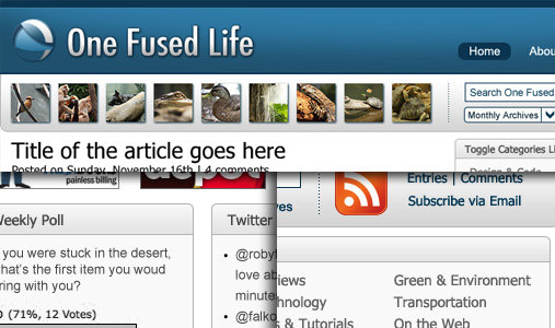
Here it is! After a few weeks of thought and decision making, here are the final* visuals that will be turned into the next iteration of One Fused Life. As you can see, the site structure remains virtually the same, but the way content is presented has changed significantly.
My goal was to streamline the way content is currently being presented. In this new design, I have not only made it easier to access existing elements, but also introduced new ways to browse around and discover new content.
I will put forward my best efforts to code and launch OFL 2.0 within the next couple of weeks. On top of that, I have some GREAT content coming up!
Please click here to subscribe to me feed. Thank you!


Did you come up with that icon yourself? I quite like it.
Every element of the design was created by me, except the RSS Icon. I thought of making one myself, but there was a perfectly good one already available, haha.
You know, I always thought about creating a nice artsy website like you see on CSS galleries and all, but I figured this take on the design would be better.