 Here is a tutorial showing how to recreate the world famous Fox News logo. A Google search for the Fox News logo gave poor results so I figured I'd show you how to make one yourself. The techniques in this tutorial can be applied to many other tasks throughout the suite of Adobe applications.
View the tutorial after the jump!
Before beginning, I should mention to you that you don't have to follow the directions exactly as written. The power of Photoshop is unveiled through experimenting and trying out different ways of doing things.
1) First I open a blank document with the following dimensions: Height of 175px and Width of 275px. You can name it whatever you want. In my case, it's fox5logo.psd.
2) I started by creating 3 different box shapes to set the foundation of the logo. Using the Rectangle Tool (Key: U), draw a light colored vertical rectangle in the middle (the biggest one). Once that's done, draw two more boxes in a darker color on top and on the bottom of the main rectangle.

Note: Make the box on the top a little bigger than the one on the bottom. We will fix larger text inside the box on the top.
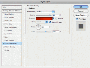
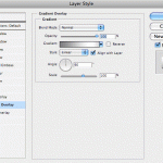
3) Now select the layer for the top box. Go to the Blending Options of this layer by right clicking the layer and selecting Blending Options. Select the Gradient Overlay in the window that pops up and enter the following settings:
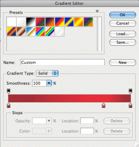
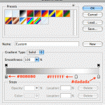
Colors used for gradient: The darker red is #a00404 and the lighter red in the middle is #e60000.
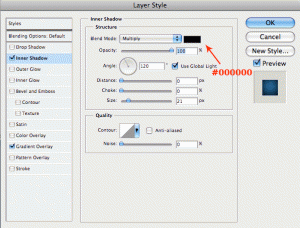
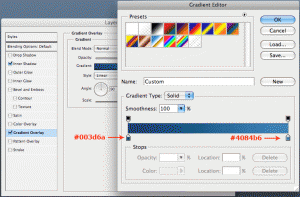
4) In this step, we will decorate the middle box with a gradient and an inner shadow. Go to the Blending Options menu of this layer and apply the following settings:
So far, you should have something like this: (If you don't, contact me for help!)
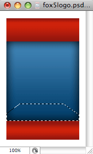
5) Now we will create the base which the big number "5" will rest on. Create a new blank layer on top of the middle box and name it "base". Select the Polygonal Lasso Tool (Key: L) and draw a shape that looks like this:
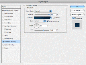
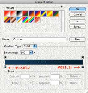
Fill the selection with a solid color (Edit > Fill... > Press OK). Then deselect the slection (Select > Deselect). Access the Blending Options of this layer and create a Gradient Overlay with the following options:
6) Now that we have the base of "5" completed, we can create the light beams in the background. To do so, create a new blank layer on top of the base layer and name is "light beams." Use the Polygonal Lasso tool (Key: L) to draw the two light beams on the left side of the logo, like this:
Note: Once you make the selections for the beams, fill them with white color.
Hint: In order to draw two separate shapes after another, hold down the SHIFT key after completing the first shape selection and you will see the Polygonal Lasso with a + sign to make additional selections.
Use a fairly large soft eraser (125px with 0 Hardness) to erase the upper portions of the beams in order to make it look like a fade. For intermediate users: If you're familiar with masking, apply a Quick Mask to this layer and use a large black soft brush (125px with 0 Hardness) to hide away the upper portion of the beams with a fade. Then drop the Opacity of the layer to around 25% or whatever looks right to you. This is what you should have so far:
Once you complete the beams on one side, duplicate the "light beams" layer and flip it horizontally (Edit > Transform > Flip Horizontally). Then move the layer to the right side as if they were reflected, like this:
7) Now here comes the easy part; The text. You're going to need a very thick font for this. I used Verdana set in Bold and it worked like a charm. Use your visual judgment to create the text proportionate to what you see in the final result. NOTE: Make sure these text layers are created above all the other layers.
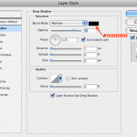
Now to make the text look fancy, we will apply a simple Drop Shadow and Gradient Overlay in the Blending Options with the follow settings:
Note: You're not limited to what settings you can apply to the text. Use your imagination and go crazy! (not too crazy, though.) Here's the result after playing around with the Blending Options. Nice and simple:
That's it! Simple as that.
If you have any questions or trouble with the tutorial, I invite you ask away in the comments section below. Chance are, you're not the only one with the problem. I'll be glad to help anyone! Thank you!
Disclaimer: I am in no way affiliated with Fox News and the Fox News logo is copyright to the respective owner(s). This tutorial was written solely for educational purposes and the enhancement of people's Photoshop skills.






It is so cool what you did. It is very detailed and teaches many important steps. Job well done.
How is everything by the way? how is life? I have not seen you for long time? maybe we will stop by later? Are you working currently? 🙂
There is obviously a lot to know about this. I think you made some good points in Features also.
Can you make one for Fox 11 news
That's our local station in Orane and Los Angeles Counties in Califonia?
Hi Bryan,
It shouldn't be difficult to follow the same exact steps in this tutorial, but instead of the 5, just put "11" in the font that best matches the actual logo. Let me know if you have trouble, or if you are talking about something totally different.
Thanks for your contribution is a exelent tutorial, very well detailed. I done all what you say in the tutorial and I could make that logo without any problem.
I'm sorry for my english. I am from Central American.
My college missions group has been looking a logo design that very similar to the FOX logo that you have greatly shared with the public. Is it possible to use the same gradients and shape designs and just replace the words "FOX" and "NEWS" and also replace the "5" with our own stuff? Or is the design in a copyrighted format?
Thomas,
If you created a logo with that style, you WILL face the risk of copyright violation, and Fox may take legal action. Even if you changed the words, the design & style may reflect Fox News' actual logo.
If you are serious about getting a logo designed, I can provide a custom solution. Use the Contact page to get in touch with me.
Nice tutorial. Love the final result. Will definitely prove to be useful in the future.
Thanks a lot.
It would have been nice if you had chosen the logo of a more worthy organization than this organ for Right-Wing propaganda.
This is a very good post! Keep them comming!
We are LogoProDesign as a Custom Logo Designer, We checked your artwork collections. Those are amazed us. Thanks for that type of good work collections. We regularly checked your website for good artwork example.
Thanks
David Thomas
Very good post! Keep on! I love photoshop...
Could please help figure out the colors used for a specific Fox News channel logo I have ? .. Could you please send me your private email address to send you the logo I'm talking about .. I really need your help .. Thank you in advance ..
Use the Eyedropper tool, Danny!